Monday, September 29, 2014

Jean Metzinger and His Variously Styled Women

Jean Dominique Antony Metzinger (1883-1956) is usually associated with Cubism, though seldom ranked as highly as Pablo Picasso, Georges Braque and Juan Gris in that aspect of modernism. However, Metzinger, along with Albert Gleizes, attempted to codify cubist practices and generate a theory of Cubism in their book Du "Cubisme" that appeared in 1912.

There are lengthy biographical articles on Metzinger on the Internet. His Wikipedia entry is here. Another long essay that is richly illustrated can be found in two places: here and here.

I must confess that I was unaware of Metzinger until very recently when I began searching for cubist portraits. Although he is hardly unknown to art history, it seems that he has been somewhat bypassed in the Modernist Establishment timeline that culminated in Abstract Expressionism of the 1950s. Perhaps this was because he reverted to a restrained version of modernism by the 1920s, failing to take up Surrealism or full-blown abstraction.

Metzinger seemed to enjoy portraying women. With that in mind, I summarize his career in the series of paintings featuring women in the Gallery section below.

Gallery

Femme assise au bouquet de feuillage - 1905

Femme au chapeau c. 1906
Metzinger was in his early 20s and trying out modernist styles. In these two paintings he is experimenting with Divisionism, a Postimpressionist approach.

Le goûter - 1911
Some sources credit this as Metzinger's breakthrough Cubist painting. Braque and Picasso had been painting in the Cubist style for two or three years at this point.

La femme au cheval - 1911-12
The title says this is a woman with a horse -- but I'm sure you could tell that already by simply looking at the image.

Danseuse au café - 1912
Note Metzinger's use of light in this painting and the two previous ones. These are in the spirit of Analytic Cubism, but the bland colors favored by Picasso and Braque in this cubist phase are ignored. Instead, we see the effect of light sources on the cubistically reassembled objects. One result is a feeling of depth, rather than the flattened picture plane favored by other cubist painters. I find this very interesting.

Les Baigneuses - 1912-13
A cubist landscape with bathing women that also features light shining on subjects.

Femme à la dentelle - 1916

La tricoteuse - 1919
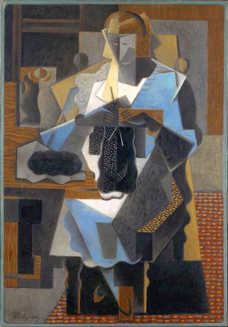
These two paintings reflect the late-style Synthetic rather than earlier Analytic Cubism. Metzinger soon abandoned Cubism for many years.

Jeune femme pensive aux roses rouges - 1923
After the Great War many modernists recoiled from the "isms" that had been created in the years leading up to the conflict. Some, like Picasso, returned to more hard-core modernism. Others retained some representation of subjects, but included modernist affectations such a a flattened picture plane, simplification of shapes and so forth. Here Metzinger relies mostly on simplification.

Salomé - 1924
And here he uses both simplification and distortion as modernistic effects.

Femme debout - 1935
In the mid-1930s Metzinger continued to paint women in the then-fashionable simplified, solid-appearing manner.

Nu au hortensias - 1935
A touch of Cubism possibly returns here in the form of the unusual light-shade pattern.

La baigneuse (nu) - 1936-37
Here Metzinger flattens the picture plane somewhat.

Yachting - 1937
Hints of Cubism in the background, but the interesting treatment of the woman is non-cubist.

Portrait de femme en vert - c. 1940
A highly designed composition with a flattened picture plane, simplifications, some color distortion. Yet the drawing of the woman's head is so strong that those details are ignorable.

Nu couché - 1946
This postwar painting continues Metzinger's Cubism-lite that was seen in Femme en vert above.

Friday, September 26, 2014

Santiago Michalek, Painter of Rusty VWs

I recently noticed Santiago Michalek's paintings at the Bellevue Arts Festival, which evolved from a show of paintings by the better Seattle area artists back in the 1950s to what's now pretty much a crafts street market. As implied, a few painters do exhibit there, and Michalek struck me as the one with the most talent.

His Web site is here, the linked page containing some biographical information. Michalek lives in Utah, but was born in Argentina and claims to be self-taught. His passion is old Volkswagens -- usually Microbuses. But he paints locomotives and other transportation objects -- and even does people.

Below are images of his paintings that I grabbed mostly from his Web site.

Gallery

Early VW in garage

Murphy's Wholesale
A Derelict VW Microbus.

Silver Plane

15328 Engine

Switching Yard
I remember this from the show. It's fairly large, giving Michalek room to paint both tightly (the Baltimore & Ohio diesel locomotive) and freely (the background).

Color Study

Motion Figure

Wednesday, September 24, 2014

John Falter: Major Post Cover Illustrator

If doing paintings for Saturday Evening Post covers marked the zenith of an illustrator's professional career, then John Falter (1910–1982) was near the top of that elite group during Ben Hibbs' time as editor from the early 1940s to the early '60s. That's because he painted more than 100 covers over a 20-year period. (The count varies. One source says 129, others claim upwards of 200. Regardless, he was liked by the Post and prolific.)

More information about Falter can be found here and here. A gallery of his Post covers can be accessed here.

Falter was one of those illustrators whose work was highly competent, yet lacked a strong personal style -- a trait that seems to be necessary for lasting recognition and, especially, fame.

Gallery

Early pulp magazine cover art. It shows more style than his later works.


Two World War 2 U.S. Navy recruiting posters. The one showing the aircraft carrier has factual errors that might have raised the hackles of a sailor, but probably went unnoticed by most potential recruits. (The carrier is a Lexington class ship, probably the Saratoga. The Sara lost those big 8-inch guns early in 1942, but the F4F fighter shown has insignia that didn't appear until mid-year. The Lexington was sunk in May of that year.)

Wartime art for a Pall Mall cigarette advertisement.

Falter could do abstract art, too.

This has the look of Post cover art, but a quick look at Google Images didn't turn up a cover. Maybe it's buried in the cover images link above.


Two representative Falter covers for the Post.

A 1960 Post fold-out cover showing New York's Grand Army Plaza at Fifth Avenue (at the the left) and 59th Street (foreground).

Monday, September 22, 2014

"Miscellaneous - C" Images

I like to download art images from the Internet to my computer. Some are intentional grist for a post that I'm working up. Others are collected because I really like them. And then there are those serving as aides-memoirs of paintings that catch my eye for potential future collecting of images. At some point, when I have a lot of images by an artist, I'll create a directory ("folder" seems to be the term of art these days) for that artist, moving those images from a "Miscellaneous" directory to the new artist-based one.

Today's post contains images from my Miscellaneous directory for painters, and I'm selecting from those artists whose last names start with the letter C.

The original paintings were made during the 70-year period between 1870 and 1940, a time when Modernism was on the rise from ignorable quirkiness to near-domination in fine-arts painting. By the time I was being brainwashed in college, many or even perhaps all of the images shown below would have been greeted by a sniff and a condescending remark by modernist cognoscenti.

Yet I now find that same 1870-1940 period endlessly fascinating for both mainstream Modernism and art that ignored Modernism entirely or selectively nibbled at it. Of course, I am not alone nowadays, because the previously ignored non-Modernist art is regaining the respect it was denied in the 1950s.

The images shown below are in alphabetical order of the artist's name and reflect no particular theme. Have fun looking at them.

Gallery

Cabanel, Alexandre - Samson and Delilah - 1878

Cadorin, Guido - Decorazioni del salone all'Hotel Ambasciatori (detail) - 1926

Caputo, Ulisse - Lavoro di sera

Citroën, Paul - Corry Mohlenfeldt - 1939

Clark, Alson - Portal, Mission San Gabriel - 1919

Constant, Benjamin - Afternoon Languor

Cortès, Edouard-Léon - Champs Élysées scene

Cucuel, Edward - The Bather

Cursiter, Stanley - The Fair Isle Jumper - 1923

Czachorski, Wladislaw - The Proposal - 1891

Friday, September 19, 2014

Men's Suits: Drapery Extremes

Many things seem to swing between extremes. Not all extremes reach absolute limits, but they can come close to something like limits imposed by practicality. That is the case for the subject of this post: the amount of cloth used in men's suits.

It turns out that two extremes were reached about 20 years apart. Around 1940, fad apparel for some young men was in the form of the Zoot Suit, an exaggeration of current men's suit styles that already were rather baggy. By 1960 fashionable men's suits were snug and used minimal material. Lapels were narrow, as were neckties. The archetypical suit had three buttons and the two upper ones were buttoned down. On college campuses, this was sometimes called Ivy style, after the prestigious group of colleges and universities in the Northeastern USA (Harvard, Yale, Princeton, Penn, Columbia, Dartmouth, Brown and Cornell) where the mode of dress was supposedly popular.

Gallery

Here is a Zoot Suit. Its characteristics include: Baggy, high waisted trousers "pegged" (narrowed) toward the cuffs. A loose-fitting suit jacket with wide lapels, heavily padded shoulders and a hem down toward knee level. An extremely long key chain was a usual accessory. Neckties might be long or (as in this case) bow, in both instances using plenty of material.

Two Zoot-suiters with a young Army sergeant (who himself might have worn a Zoot Suit a year or two earlier).

The great Cab Calloway in 1942 wearing an exaggerated (yes, it must have been possible) Zoot Suit for a performance.

Now it's 1961 and we find Audrey Hepburn and George Peppard on New York's Park Avenue during the filming of Breakfast at Tiffany's.  Peppard is wearing an Ivy style suit, but for comfort's sake has it unbuttoned.

Wednesday, September 17, 2014

William Aylward, Illustrator of Nautical Scenes

William James Aylward (1875-1956) came from a Great Lakes shipping family, was a student of Howard Pyle, and usually illustrated stories with nautical themes.

Biographical information about Aylward is skimpy. Two sources are here and here. The Kelly Collection site deals with him here.

Having been accepted by Pyle as a student signifies Aylward's potential as an illustrator, which was fulfilled in most cases. I do include one poorly-done example below from late in his career.

Some of the titles of the illustrations shown below are truncated. Those lacking capital letters are conjectural titles.

Gallery

Coming to America

Contrasts - 1905

future airships? - McClure's Magazine - 1905

storm scene - Harper's - 1909

Surrender of the Guerriere - Harper's - March, 1912

Perry Transferes His Flag - 1913

Mystic, Connecticut - 1916

battleship - c. 1943
This looks like a North Carolina class battleship, though a number of things seems "off" to me. For instance, the ship is too foreshortened for the viewing angle. The North Carolina and Washington had long bows, so it's possible that Aylward used some artistic license to better fit the ship into a compositional scheme. In any case, the top of the hull is too low at the front (there's much more of an upwards curve on the actual ships) and the main turrets are more distant from the prow than is shown here. The foremast structure and, indeed, all the superstructure elements shown are seemingly too high and definitely too large compared to the main turrets. The problem here is that the perspective is a mess. The anti-aircraft guns mounted high on the superstructure appeared late in the war on the North Carolina, but by that time the foremast was much more cluttered than pictured here in its 1941state. I really have no idea why an artist as experienced as Aylward would let all this happen.

SS America Bringing Troops Home - c. 1945