Friday, January 31, 2014

Up Close: Curry's "State Fair"

John Steuart Curry (1897-1946) is best known as a Regionalist or American Scene painter who, like fellow American Scene artist Thomas Hart Benton, enjoyed making turgid scenes featuring people in exaggerated poses.  Perhaps a bit more than Benton, Curry often placed lots of people on his canvasses and murals.  Both artists were most active during the 1920s and 30s when, as my e-book (shameless plug!) explains, the painting world was adrift, not really knowing how to deal with modernism.

The Wikipedia entry for Curry is here, and a longer biographical sketch can be found here.

Living on the West Coast, I don't get to see much of Curry's work which is mostly found in the Midwest or East Coast. Fortunately, the Huntington Library (links here and here) in San Marino, California (near Pasadena) has a nice 1929 Curry in its collection called "State Fair." Click on the images below to enlarge.

Gallery

Here is an image of the entire painting that I found on the Web. As you can see, it contains a cast of hundreds, if not thousands. The dominant colors are red and a complimentary blue-green; more on this below.

I took this close-up photo and the one below when I visited the Huntington in November. Here you can see how Curry simplified most of the faces of his subjects. He also gave some a blue-green complexion while others have more normal pinkish skin. The most obvious examples here of the former are the boy just below the barker's hand and the gold-haired lady at the left with her back to us.

The image of the entire painting reveals that the woman featured here was given a rather large (excessive?) pelvis area and legs. But the segment I photographed seems anatomically satisfactory. Note Curry's use of both reddish and greenish hues on the unclothed areas. I suspect that Curry found her the most interesting part of the painting to deal with because he seems to have spent the most thought and care here.

Wednesday, January 29, 2014

The Mysterious Manuel Orazi

Manuel Orazi (1860-1934) was an Italian with a Spanish first name whose career was spent mostly in Paris doing Art Nouveau style illustration when he wasn't involved in depicting the occult. And that's pretty much all that is known about him.

Actually, there is more. But as often seems to be the case, it is in bits and pieces scattered across the Internet. If, having seen the images below and you are curious about Orazi, link here, here, here, here and here.

Gallery

Sarah Bernhardt - c.1895

Theatre de Loïe Fuller

Job cigarette papers poster

Poster for Boulevard de Clichy Hippodrome

La Belle sans nom (The Pretty Girl Without a Name) - Le Figaro Illustré - January 1900

Poster for La Maison Moderne (Modern Home) - 1902

L'Atlantide poster - c.1920-21
La reine Antinéa - L'Atlantide (Queen Antinéa) - 1920
Le lieutenant de Saint-Avit et la mort - L'Alantide (Lieutenant Saint-Avit with Death) - c.1920-21
These are related to the film L'Atlantide, which Orazi had a hand in besides poster work.

Paris by Night - Dance Club in Montmartre
A late work with no trace of Art Nouveau or the occult.

Monday, January 27, 2014

Carl Moll: Secessionist of Sorts

Vienna artist Carl Moll (1861-1945) committed suicide 13 April, along with members of his family, ten days before his 84th birthday, when the city was surrendered to Soviet forces in the waning days of World War 2.

I could find no extensive biographical information on Moll on the first few pages of a Google search. But you can glimpse his career by linking here, here and here.

As this Wikipedia entry indicates, the Vienna Secession was essentially a rejection of, or rebellion against, the academic traditions and organizations of the city. But it did not promulgate any particular replacement style: Secession artists were basically free to do what they wished.

In Moll's case, this was to paint slightly simplified landscapes and townscapes, though his earlier paintings (and a fair number of Secession-era works) were traditional in style. He also seems to have followed his almost exact contemporary and fellow-Secessionist Gustav Klimt's landscape preference for square canvasses. Not having seen it in person, I'm not sure if I can call Moll's art great, but most of what I've found on the Web seems competently done and pleasing.

Gallery

Der Naschmarkt in Wien - 1894

Mein Wohnzimmer (My Living Room) - 1903

At the Sideboard - 1903

View of Nussdorf and Heiligenstadt in Twillight - c.1905

Winter Scene in Heiligenstadt - 1906

View of Heiligenstadt

Rain in Rapallo

Tuscany Near Volterra - c.1931

Friday, January 24, 2014

John Stanton Ward, Almost-Traditionalist

It seems like I've recently been stumbling across quite a few works by artists who might be known in their home countries, yet were unknown to me (and probably many others) here in the States.

So it is with today's subject, John Stanton Ward (1917-2007), an English portrait painter and, for a time, illustrator. Even though he was tight with the royal family, he was never knighted, so that might have helped reinforce his relative obscurity. And of course he wasn't a hardcore modernist or some species of postmodernist. In fact, he resigned from the Royal Academy in protest of the likes of Tracey Emin being featured in exhibitions at Burlington House.

You can learn a fair amount of detail regarding Ward on his Wikipedia entry here, but perhaps even more via his obituaries in the Guardian and, as one might expect, the Telegraph.

And yet. If Ward had no use for British postmodernism, his own work tended to be casual, though usually based on sound drawing. (However, aside from his deliberately sketchy paintings, Ward seems to have had trouble drawing subject's arms convincingly.) To some degree this was in the spirit of modernism, if only in the sense that conventions of academic painting were reacted against -- Ward's reaction being highly selective. Besides a casual style, he tended to paint thinly (obviously so when using watercolor, a favorite medium) while relying on linework to carry the image. Also of interest is his approach to composition, where elements strike me as being a bit "off" from conventional practice. All told, I find him a very interesting artist. Let's take a look:

Gallery

Ward painting Princess Anne - c.1988

Portrait of Princess Anne

Annabel's - 1985

Positano - 1987

Poppy

Sir Thomas L.P. Norrington, President of Trinity College - 1967

Sir John Ellis - 1982

Sir Roger Bannister, Master, Pembroke College, Oxford - 1987

The East Kent School - 1987

Gillian - pastel - 1993

Two Girls, Pictured Inside, with Grapevine - 1993

Wednesday, January 22, 2014

Yoshihiro Inomoto: Putting Emotion into Tech Illustration


What's going on here?

I really wanted to feature a couple automotive cutaway illustrations by the great Yoshihiro Inomoto (b. 1932), but most of the best are under extremely heavy copyright protection for reasons I find hard to understand. Seems to me, providing plenty of web publicity for Inomoto's work would increase sales of printed images and therefore benefit the copyright holders, but whadda I know. At any rate, I think I'm safe from prison by displaying publicity materials for an Inomoto exhibition I found on a Russian web site (see above).

Unfortunately, those materials really don't provide the full impact of an Inimoto illustration. So you need to link here for some fine (and copyright protected) images.

The site also includes biographical information on Inomoto as well as some fascinating details regarding how he works. It seems that he begins by making freehand drawings and then refines these using traditional mechanical drawing tools such ellipse templates. An alternative he apparently rejected was to begin by constructing detailed three-view drawings and then projecting to a 3-D image using architectural perspective techniques, something aviation artists often do. Another interesting twist is that Inomoto actually distorts some of the objects in an image such as brakes or the motor to suit his emotional reaction to the vehicle he's illustrating. This sort of thing must be pretty subtle, because I never noticed it before.

So this is about all I can do for now. Please visit the link. If what you see interests you, you can find images via a Google search.

Monday, January 20, 2014

Fortunino Matania and His Coup d'œil

Fortunino Matania (1881-1963) was an illustrator whose technical prowess has recently gained some attention in the illustration corner of the Internet. His Wikipedia entry is here, and he is mentioned here in a Dan Dos Santos post on the Muddy Colors blog and here on James Gurney's blog.

I strongly recommend that you read both the Dos Santos and Gurney posts which deal with Matania's extremely strong visual memory and his ability to compose an illustration on the fly, without preliminary studies. The Wikipedia biography offers background information about his career journey from Italy to France (briefly) and on to England, where he spent the rest of his life.

Gallery

Illustration for "A Princess of Mars"
Blackpool
Southport poster
First, some examples of his commercial work.

"The Capture of the Sugar Refinery at Courcelette by the Canadians on September 15, 1916"
Munitions factory scene
The Last Message
Matania seems to be best known as a war artist. He liked to paint pretty women, so the munitions factory scene is populated with them.

London Omnibus
This was probably painted only a few years after he moved to London in 1904. The omnibus route signs suggest that it went from the West End to northern boroughs, but here it is probably pictured near Piccadilly, to judge by the women's clothing.

Southport Wintertime, poster
I don't have a date for this poster, but one web site featuring it says circa 1933. There's a green car in the background with an early fastback body, so that inclines me to peg it more like 1935, but probably not much later. Note the Art Deco design on the front of the building. I seriously need to get my time machine fixed so that I can join that crowd.

Friday, January 17, 2014

In the Beginning: Andy Warhol

I consider Andy Warhol (1928-1987) as something of a joke so far as being a Fine Arts practitioner is concerned. Like Picasso, his main talents were in sniffing out incipient changes in cultural trends and in self-promotion. As artists, I regard them as being average-professional in their abilities. (In part that's because I don't rank "creativity" as the most important consideration when evaluating art.)

As for Warhol, back in the days before he made reproductions of photos of Marilyn, Liz and Elvis that now auction for millions of dollars, he actually drew. And he seems to have been fairly good at it.

But those drawings were not Fine Art pieces. They were commercial art, what he studied in college (I did too). His work was good enough for him to survive in the highly competitive New York market -- no small achievement. Better yet for him, his sensitivity to the marketplace might have been a factor in taking up Fine Art just as the market for illustration was about to begin its 1960s decline.

Here is some of Warhol's commercial work.

Gallery

Schiaparelli ad

Record album cover - 1958
This is in the stylistic spirit of late-1950s illustrators such as David Stone Martin, who I wrote about here and here.

I. Miller ad - 1958

Fashion accessories drawing - 1959

Ad art - 1960

Wednesday, January 15, 2014

Albert Whitlock, Matte Master

Nowadays, computer-generated images are used. But up into the 1980s, movie sets and settings were expanded to fill up the screen via paintings that sometimes were supplemented by scale models.


The alternative would be to create expensive, full-scale sets such as the one shown above for the D.W. Griffith movie "Intolerance" from 1916. And for scenes in natural settings, the setting would have to be found, a production unit sent there and then might have to wait and wait for the correct atmospheric effect to appear. Better to build part of a set or film only a fragment of the countryside and then paint the rest. Much more convenient and usually far cheaper. As a result, most movie studios by the 1930s had teams of artists creating matte paintings. For a number of years use of matte painting was a kind of trade secret, studios fearing that audiences might feel cheated if they knew that many scenes were partly or even largely faked. Eventually, matte art became known and even honored at Oscar time.

For me and many other observers, one of the very best matte painters was Albert Whitlock (1915-1999). Background information on him can be found here, here and here.

Whitlock usually painted freely unless he was constrained by having to have his image merge with sound stage items with hard edges such as furniture, doorways, windows and other architectural or interior-decorative features. Another kind of constraint was that the painted part of the final image had to match the filmed part in terms of color, shadow angles and other details that, if not done with care, would reveal the painted part for what it was. Not the sort of thing most fine-art painters have to deal with. And by the way, some movies might require dozens of such paintings to be done under time constraints.

For more about all this, I highly recommend this blog. The Whitlock images presented below were shamelessly lifted from various posts.  Click on them to enlarge.

Gallery

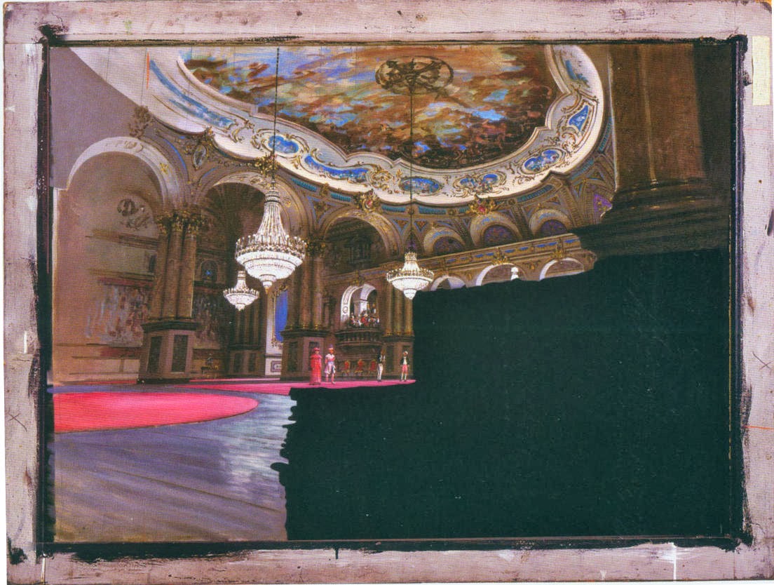
Day of the Locust - 1972
Much matte work was to expand partially built sound stage interiors. This example shows the blacked-out area reserved for the action filming. This would be the part of the screen that attracted the audience's eyes, so the matte part didn't necessarily have to be crisply painted.

Earthquake - 1974 - full painting
Part of Los Angeles following a hugely destructive earthquake. Impossible to create as a movie set, and difficult and costly if model buildings were made.

Earthquake - 1974 - detail from printed publication
This shows Whitlock's free brushwork. It allowed him to create the painting more rapidly, yet the sketchiness wasn't detectable when seen in a theater.

Frenzy - 1972
This matte is of London's Covent Garden. Note the exaggerated perspective.

Greystoke - The Legend of Tarzan, Lord of the Apes - 1983
A good deal of matte work created atmospheric effects that could not be conveniently found when filming on location.

Hindenburg - 1975 (detail)
The airship Hindenburg was destroyed in 1937 and support facilities such as hangars are gone or have been changed since then -- so bring in Al Whitlock to create the scene.

Tobruk - 1967
Only the road and trucks are real in this composite.