Friday, June 28, 2013

Antonio Sant'Elia, Visionary Draftsman

Antonio Sant'Elia (1888-1916) was a highly influential architect, almost none of whose designs were ever built. One reason why little was built was because he was killed during the Great War, age 28.

His fame rests on an early modernist/Futurist theoretical architecture project called La Città Nuova (The New City) carried out around 1914. This was essentially a series of speculative architectural sketches and renderings that astonished architects of a modernist bent over the years as well as the architecture-appreciating general public, myself included.

A fairly brief Wikipedia entry on him is here. This Italian language site has both a brief biography and a link to a timeline.

It's out of print, but so far as I know, this book by Esther da Costa Meyer is the most comprehensive work in English dealing with Sant'Elia. She mentions that the Città Nuova concepts were largely un-buildable as depicted.

Regardless, Sant'Elia's renderings make for very nice art in themselves, regardless of their architectural merits.

Gallery

Station for airplanes and trains, La Città Nuova - 1914

Temple of Fame - Monza cemetery - with Italo Paternoster - 1912
A design for an architectural competition. The rendering is by Sant'Elia. According to da Costa Meyer, the extent of Paternoster's participation is unknown.

La Città Nuova - study of structure with terraced floors

La Città Nuova study - 1914

Electric power station, La Città Nuova - 1914

La Città Nuova, particolare - 1914

Wednesday, June 26, 2013

Up Close: N.C. Wyeth

This is part of an occasional series dealing with detail images of paintings featuring the brushwork of the artist. Previous posts can be found via the "Up close" topic label link on the sidebar.

The present post deals with N.C. (Newell Convers) Wyeth (1882-1945), a prize student of Howard Pyle. Additional information on Wyeth can be found here and here.

Featured here is "Long Line of Prisoners," an illustration for the 1927 Charles Scribner's Sons edition of "Michael Strogoff, A Courier of the Czar" by Jules Verne.

The source of the detail images is explained below:

* * * * *

The Kelly Collection has what is probably the outstanding holding of American illustration art by private individuals (not organizations). I was able to view part of it at The Frederick R. Weisman Museum of Art at Pepperdine University in Malibu, California towards the end of a January 12 - March 31, 2013 exhibition run. The collection concentrates on illustration art created roughly 1890-1935 and one of its purposes is to further knowledge and appreciation of illustration from that era.

Non-flash photography was allowed, so I took a large number of high-resolution photos of segments of those original works. This was to reference the artists' techniques in a manner not always easy to obtain from printed reproductions. (However, the exhibition catalog does feature a few large-scale detail reproductions.)

I thought that readers of this blog might also be interested in seeing the brushwork of master illustrators up close to increase their understanding of how the artists worked and perhaps to serve as inspiration for their own painting if they too are artists.

Below is an image of the entire illustration coupled with my work. Click on the latter to enlarge.

* * * * *

Reference photo that I took.


N.C. Wyeth is perhaps the best known illustrator from its Golden Age. His painting style varied over time, subject, and his goal at the time they were made. For example, by the 1930s he was spending considerable effort as a "fine art" painter, feeling that illustration art was inferior. However, when people think of Wyeth's work, they usually associate him with book illustrations he made during the 1910-20 decade. In those paintings he often used an Impressionist-inspired style based on short, distinct brush strokes of varying color over an area, where the top (and dominant) color strokes partly covered strokes of a different, sometimes contrasting color.

The illustration featured above was done later, and the Impressionist style is essentially gone. In its place is a flatter style. Wyeth still overlaid colors, but contrasts are less obvious and the short brush strokes are missing. Some outlining was present in his classic book illustration style, and that is continued here. Furthermore, this illustration is comparatively thinly painted; at the same time, illustrators such as Dean Cornwell and Mead Schaeffer were applying oil paint generously indeed.

Monday, June 24, 2013

Catalog Imitates Art


The image above is smaller than I would like, but it's the best I could do short of scanning the front cover of a mid-June catalog from Coldwater Creek, a Sandpoint, Idaho based clothing retailer. I noticed it because my wife, a Coldwater Creek fan, had it sitting by our back door, probably anticipating a shopping expedition.

The image struck me because it greatly resembled:

Paseo a orillas del mar (Walk on the Beach) - 1909

This is one of Joaquin Sorolla's better known paintings. It can be seen in the Sorolla museum in Madrid, the artist's former residence.

It's nice to see that Sorolla is getting some backhanded and very subtle recognition. Now I'll have to keep my eyes peeled to see if future Coldwater catalogs have cover art mimicking other paintings.

Sunday, June 23, 2013

Blogging Note: I Started a New Blog

As regular readers know, I enjoy posting about automobile styling. And as you can see on the right-hand panel, I even wrote an e-book on the subject (another one is on the way). I don't want to short-change those readers who expect me to write about painting and other graphic arts, so I thought I'd reduce the amount of car stuff by putting much of it in a different blog.

That new blog is called Car Style Critic, and you can link to it here.

However, I'll still be cross-posting some of my styling posts here because (1) I need to keep my blogging workload under control and (2) many Art Contrarian readers might find them interesting.

Speaking of Art Contrarian, I've made some cosmetic changes. Probably the most important one is an increase in the size of the body type to improve readability. I finally figured out how to change the photo of me. And I added links to the book cover images to assist all of you who are anxious go to Amazon to purchase the books for downloading to your Kindle or iPad.

Friday, June 21, 2013

De-Modernizing Modernist Architecture in Victoria

In my opinion, modernist architecture usually works best when it is in a non-modernist setting. That setting might be a large lot filled with trees, gardens and lawns if the building is a residence or, if it is in an urban location, surrounding buildings having traditional architecture. If the structure is well-designed, it can have a jewel-like character.

But a large cluster of modernist buildings tends to be visually sterile and anti-human. After all, we humans evolved in natural settings filled with complexity and details -- not classical geometrical shapes. Which is why most pre-modern buildings of importance in Europe, Asia, Egypt and Central America employed ornamentation to varying degrees.

An example of classically sterile modernism applied to apartment structures is the 860-880 Lake Shore Drive complex in Chicago. They were designed by the sainted modernist Mies van der Rohe, so using that example shouldn't be regarded as a cheap shot on my part.

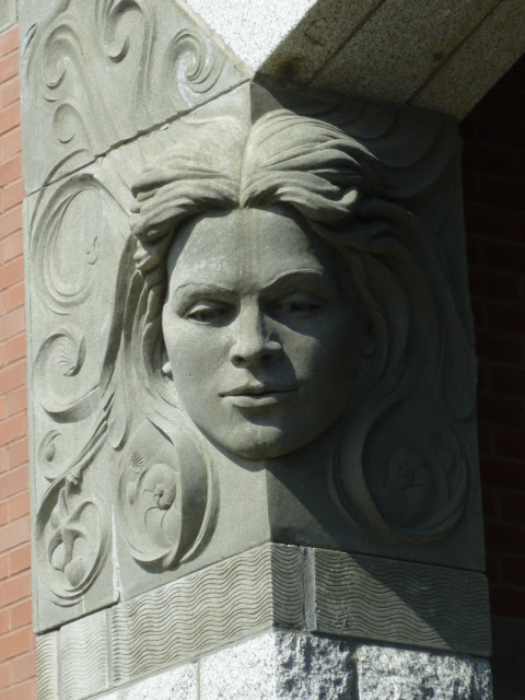
A postmodern structure that comes close to traditional appreciation of complexity of detail is the Shoal Point Condominium in Victoria, British Columbia. It's the large, reddish structure behind the houseboats in this photo that I recently took (click my images to enlarge slightly).

The architect is Paul Merrick, whose firm's Web site is here.

A snotty, condescending modernist take on Shoal Point by Trevor Boddy in Toronto's Globe and Mail is here

Admittedly, Shoal Point lacks clarity in terms of basic form. But that doesn't bother me because nature itself often lacks visual clarity. And an apartment or condominium building does not require the clarity of a train station or airport terminal. Shoal Point uses a number of common elements such as window shapes, but stirs them into a tangle where they visually pop out here and there rather than march together like soldiers on parade. And it also employs a good deal of ornamentation. Let's take a closer look.

Sculpted elements are by Victoria artist Derek Rowe (no Wikipedia entry or personal web sit at the top of a Google search, but there is this).


This is the entrance by Dallas Road.  There's a definite Art Nouveau feel to it, though the ironwork pattern is geometric (Secession?) rather than organic.  I was taken by the sculpted faces.

Note the thematic seashore elements (starfish, seashell) in the lower hair swirls as well as fish in some of the images above.

Wednesday, June 19, 2013

Unconvincing Matte Paintings

Nowadays computer graphics are used, especially if the entire film is digitized. But up to around 20 years ago, the production costs of movies were held down by building partial sets and filling the rest of the screen with what is called a matte painting. A nice book on the history of matte painting is "The Invisible Art" which, unfortunately, seems to be out of print. I've been re-reading my copy and it brought to mind scenes that used matte painting undetectably and others where the artifice was obvious. Just for fun, let's deal with the latter case.

I saw Orson Welles' "Citizen Kane" only once, many years ago. But I noticed that a number of images didn't seem realistic. For example, some of the buildings in New York street scenes of the early 1900s looked stiffly unnatural. Unfortunately, I could not find examples of those on the Internet, but have others that support my contention. Chesley Bonestell and maybe other matte artists working on the movie created sharp-edge paintings, perhaps according to Welles' wishes or possibly because that was their preferred style. The extensive Wikipedia entry linked in this paragraph notes that Welles strived to achieve "deep focus," where both near and distant objects appeared sharply defined. I'm not sure why he wanted this, but it might help explain why some of the matte shots (and the film had many) didn't work well because the paintings had to be crisply done, increasing their potential artificiality. Then again, maybe Welles didn't really want the movie to look completely realistic. Film and "Citizen Kane" buffs, please clarify this in Comments.

Much matte art was done using large brushes, especially for background objects that would be slightly out of focus anyway. Where sharp edged features such as door frames, bannisters and other manufactured objects were close to the camera's focal plane, then matte artists had to use distinct edges to blend their painting with those objects in the movie set. Otherwise, looser painting seemed to work better, especially in the years when film stock did not permit high definition for any of what was being shown.

Another point regarding matte painting is that such paintings served best for scenes lasting less than ten seconds; better yet, less than five seconds.  Otherwise, matte artists feared that viewers would discover the artifice.

Here are some examples of scenes using matte painting.

Citizen Kane - opening sequence
Kane's Xanadu, in the distance, might not quite be in sharp focus (the image I found seems a little blurred all over). But it doesn't seem "real" to me.

Citizen Kane - political convention
The matte part is the convention floor and seating. Looks like a painting.

Citizen Kane - political convention, different viewpoint
Another false-looking scene. The nearest few rows probably had live actors, and there might have been some on the stage, but I can't be sure, given this static image.

Citizen Kane - credited to Bonestell
The Gothic windows seem a little too sharply defined.

Citizen Kane - successful Bonestell matte
The reflection of the distant figure on the floor is part of the painting.

The "Star Wars" movies used a variety of special effects including matte painting. Most of the mattes were hard to detect, but a few jarred me, especially those of the Cloud City in "The Empire Strikes Back". The matte artist was Ralph McQuarrie, who did the concept art for the original Star Wars movie but had never done matte painting previously. For some reason, his paintings of Cloud City on the planet Bespin looked phoney, yet were kept in the movie.

The Empire Strikes Back - completed view of Cloud City

The Empire Strikes Back - Cloud City matte painting

The Empire Strikes Back - Ralph McQuarrie painting Cloud City matte

The Empire Strikes Back - another Cloud City painted scene

Everything is in too sharp focus and there seems to be a lack of reflected light. Also, the mattes were on view for a substantial time, which allowed their unreality to sink in. There might be other problems, but I find it hard to put a finger on them; perhaps some readers can help here too. But the main thing for me was that this special effects lapse (along with a few more minor ones) lessened my enjoyment of the movie when I first viewed it.

Monday, June 17, 2013

Up Close: Dean Cornwell (2)

This is part of an occasional series dealing with detail images of paintings featuring the brushwork of the artist. Previous posts can be found via the "Up close" topic label link on the sidebar.

The present post features illustrator Dean Cornwell (1892-1960) during the period when he was abandoning his original style for a muralist style that he was learning from Frank Brangwyn. I discussed the evolution of Cornwell's style here. A previous post about Cornwell in the present series is here.

The illustration featured here was part of a series for Bruce Barton's popular book "The Man of Galilee" (1928). More information about Cornwell's illustrations for that book can be found here.

The source of the detail image is explained below:

* * * * *

The Kelly Collection has what is probably the outstanding holding of American illustration art by private individuals (not organizations). I was able to view part of it at The Frederick R. Weisman Museum of Art at Pepperdine University in Malibu, California towards the end of a January 12 - March 31, 2013 exhibition run. The collection concentrates on illustration art created roughly 1890-1935 and one of its purposes is to further knowledge and appreciation of illustration from that era.

Non-flash photography was allowed, so I took a large number of high-resolution photos of segments of those original works. This was to reference the artists' techniques in a manner not always easy to obtain from printed reproductions. (However, the exhibition catalog does feature a few large-scale detail reproductions.)

I thought that readers of this blog might also be interested in seeing the brushwork of master illustrators up close to increase their understanding of how the artists worked and perhaps to serve as inspiration for their own painting if they too are artists.

Below is an image of the entire illustration coupled with my work. Click on the latter to enlarge.

* * * * *

Mary Washing Jesus' Feet - 1928


Cornwell's Brangwyn-based style features formal and informal selective outlining coupled with flat or modeled color areas within the outlines to create images. It is a kind of casual cloisonnism. Here Cornwell is using a good deal of pale blue along with darker versions of his subject's basic color to outline. What I have yet to figure out is the system for selecting outline colors in this and other works of this style by Brangwyn and many others active in the late 1800s and first decades of the 20th century. Does anyone know of a source for an explanation?

Friday, June 14, 2013

Alcuni Ritratti : Toto Koopman

Note that instead of the usual Molti Ritratti, this post has the ritratti count as Alcuni. That's because the star of this post, Catherina "Toto" Koopman (1908-1991), deserved to be depicted a lot, but wasn't, aside from photographically in her fashion modeling career.

I can't find much biographical information about her on the Internet. But you might try this Financial Times article about early professional fashion photography models; scroll down to locate the part about Koopman. (For American English speakers, her Dutch last name would be pronounced something like COPE-man.)

In summary, she was part Dutch and part Javanese/Chinese, was pursued by rich, powerful men, imprisoned by the Germans during World War 2 and lived the rest of her life with a female art dealer. If this interests you, this biography will be published in September. And if you can read French, that version has been available for a while.

Here is what the fuss was about:

Gallery

Frontal view of face

Profile view of face

By Joseph Oppenheimer

By Joseph Oppenheimer
This image his credited on some Web sites as being of Koopman, but I'm not sure. For instance, the eyes and eyebrows seem wrong.

By George Hoyningen-Heune - 1933

By George Hoyningen-Heune - June, 1933 Vogue magazine

By George Hoyningen-Heune - September, 1934 Vogue magazine

Wednesday, June 12, 2013

Up Close: J.C. Leyendecker

This is part of an occasional series dealing with detail images of paintings featuring the brushwork of the artist. Previous posts can be found via the "Up close" topic label link on the sidebar.

The present post deals with J.C. (Joseph Christian) Leyendecker (1874-1951), one of the most successful illustrators during the first four decades of the last century. His production of cover art for The Saturday Evening Post, America's leading general-interest magazine at the time, was roughly equal to that of Norman Rockwell.

I wrote about him here. Some other links dealing with Leyendecker are here, here, and here.

Detailed examples of Leyendecker's finished work as well as some preliminary studies are available on the Web, but I thought I'd toss in a couple more examples here.

First is an illustration called "Florist" for the Spring 1920 Kuppenheimer Style Book, Kuppenheimer being a mens' clothing company. The second is called "Woman Kissing Cupid," and was the cover art for the 31 March 1923 Saturday Evening Post.

The source of the detail images is explained below:

* * * * *

The Kelly Collection has what is probably the outstanding holding of American illustration art by private individuals (not organizations). I was able to view part of it at The Frederick R. Weisman Museum of Art at Pepperdine University in Malibu, California towards the end of a January 12 - March 31, 2013 exhibition run. The collection concentrates on illustration art created roughly 1890-1935 and one of its purposes is to further knowledge and appreciation of illustration from that era.

Non-flash photography was allowed, so I took a large number of high-resolution photos of segments of those original works. This was to reference the artists' techniques in a manner not always easy to obtain from printed reproductions. (However, the exhibition catalog does feature a few large-scale detail reproductions.)

I thought that readers of this blog might also be interested in seeing the brushwork of master illustrators up close to increase their understanding of how the artists worked and perhaps to serve as inspiration for their own painting if they too are artists.

Below are images of entire illustrations coupled with my detail photos. Click on the latter to enlarge.

* * * * *

This image is from the Kelly Collection website.


This image is from the Kelly Collection website.


Leyendecker's style was unique to the point that other artists almost never dared to imitate it. It has been commented on by many observers, so I have no strong reason to add to such commentary at this point other than to say that I always found his work fascinating. My main reason for posting this is to note that the 1920 painting is showing cracking whereas the 1923 work, like most other Leyendeckers I'm aware of, seems to be in good shape.

Monday, June 10, 2013

Ludwig Hohlwein: Poster Illustration Master

Ludwig Hohlwein (1874-1949) in my opinion was one of the greatest poster illustrators, ever. He also was one of the better poster designers of the first half of the 20th century, though in this respect he was outshone by the likes of A.M. Cassandre and others.

Hohlwein had a distinctive style, usually using the notoriously difficult (for me, anyway) watercolor medium often in flat, overlapping areas to build up images.

The quality of his work was such that his political leanings are usually ignored or downplayed by writers and critics. Critics are more likely to bring up the politics of leftist German artists such as George Grosz and John Heartfield, though seldom in a negative way. With Hohlwein, negativity would be easy to introduce, yet his work was so good that, like the case of fashion designer Coco Chanel, his views and activities are viewed with a blind eye. For example, this politically liberal artist/blogger simply enthuses about how good an artist Hohlwein was.

And what was Hohlwein's political dark side? Well, you see, he was a Nazi. A member of the party once Hitler took over Germany in 1933. Before that, he created posters in support of the Kaiser's war effort. After the Great War he did posters supporting the anti-leftist Stahlhelm (steel helmet) paramilitary organization. However, it should be noted that his political posters were "positive" in that they supported the regime without negative depictions of the regime's enemies. In other words, so far as I know, Hohlwein never created an antisemitic poster. Grosz and Heartfield, on the other hand, went to great lengths to do negative portrayals of what they despised rather than showing the presumed positive joys of a risen proletariat.

The most detailed biographical information I could find on the Web is here. And his German Wikipedia entry mentions that he was forbidden to pursue his profession until February 1946, about nine months after Germany's defeat in World War 2. So presumably the Allies noted his general support of the Hitler regime, but could find no direct connection to its negative deeds.

I begin the examples of Hohlwein's work, below, with a few of his regime-supporting works to show what they looked like. Then I include a number of the posters he made for advertisers, these being what gained him his fame.

Gallery

This encourages youth to join the Stahlhelm youth organization.

Advertising the Union of German Maidens, an arm of the Hitler Youth.

The lower red caption asserts "We are those who guarantee the future."

A 1912 poster for Audi automobiles. Around this time Hohlwein included large patterned areas in some of his posters.  Also note the Coles Phillips color dropout style.

Advertising gentlemens' clothing. Note Hohlwein's artistic license where the two men are lighted from opposite directions.

A coffee ad.

One of Hohlwein's best-known posters, this for Casanova cigarettes. Note the way the woman's face is rendered.

For a fashion event.

High-fashion perfume.

"Summer in Germany means splendid holidays!"

Advertising sport hats.

Urging women to wear jewelry.