Friday, May 31, 2013

Teachout , MoMA and the History of Abstract Art

I usually enjoy reading what Terry Teachout (biographer, playwright, librettist and theater critic for The Wall Street Journal) has to say about subjects I'm familiar with (art) and those more distant from my cultural radar (music, theater, dance). He strikes me as being a sensible man, something I suspect can be hard to find at times in the cultural world.

Not long ago on his blog "About Last Night" he posted "Getting out more" (scroll down to April 9, 2013) in which he mentions his visit to New York's Museum of Modern Art which was holding an exhibit dealing with early abstract painting. Here is one of his observations:

* * * * *
MoMA has always been provincial about pre-1945 American modernism, and "Inventing Abstraction" (surprise, surprise!) is no exception to the rule. I was astonished to see that Arthur Dove, who can lay a serious claim to having invented abstraction, was fobbed off with two paintings tucked away in a corner--though I do give the curator full credit for devoting an appropriate amount of space to Stanton Macdonald-Wright, Morgan Russell, and Morton Schamberg. That corner installation was one of the best parts of the show.
* * * * *

I quite agree. About a year ago I wrote about Macdonald-Wright in this blog and I also dealt with him in my e-book "Art Adrift" (see sidebar to the right).

Wednesday, May 29, 2013

Nelson Shanks: Successful Traditionalist

Nelson Shanks (b. 1937) never wanted to become an avant-garde, modernist painter. So he did what he could to learn traditional painting at a time when art schools such as the one I attended were stressing creativity and almost completely ignoring the basics. Even more astonishingly, Shanks has actually had a successful career while lurking under the Art Establishment radar.

His Wikipedia entry is here and the biography on his own website is here. The lack of traditional art schools (though the situation is slowly improving) led Shanks to establish his own school, the Studio Incamminati.

Shanks gives numerous demonstrations. Charley Parker writes about one here and Matthew D. Innis provides a more visually detailed example here.

The Wikipedia link includes a good deal of information regarding Shanks, including a number of quotes. The one I found most intriguing is : "I almost never do drawings, because I have found over the years that doing something in one medium and translating into another doesn't work. I like to conceive a painting in real scale and in color."

Here are examples of Shanks' work.

Gallery

Blue Kimono II
Shanks is best known for portraiture and other depictions of people -- especially women.

Danilova's Slipper (ballet shoe) - 2010
But he's competent with landscapes and still lifes as well.

Harlequin - 2007
And he pays a lot of attention to color. Note how the warm areas are set off by cool colors at the top and bottom.

Tweedle Dee
About half of this painting is neutral background. Which helps us to focus on the rest of it.

Shanks painting Margaret Thatcher

Dragonlady - 2006
Shanks painted several works featuring a low-positioned candlelight effect. Just because one's work is representational doesn't mean that it can't be interesting or creative.

John Paul II - 2002
Papal portraits almost always seem to feature their subject seated. Here Shanks has John Paul standing. And the gesture, to me, makes this one of the most outstanding papal portraits of all; it captures the man.

Monday, May 27, 2013

Up Close: Dean Cornwell (1)

This is part of an occasional series dealing with detail images of paintings featuring the brushwork of the artist. Previous posts can be found via the "Up close" topic label link on the sidebar.

The present post deals with Dean Cornwell (1892-1960) when he was following the style that gained him success as an illustrator. I discussed the later evolution of Cornwell's style here.

Featured here is an illustration for an April, 1923 Cosmopolitan magazine story titled "Garden of Peril" by Cynthia Stockley.

The source of the detail image is explained below:

* * * * *

The Kelly Collection has what is probably the outstanding holding of American illustration art by private individuals (not organizations). I was able to view part of it at The Frederick R. Weisman Museum of Art at Pepperdine University in Malibu, California towards the end of a January 12 - March 31, 2013 exhibition run. The collection concentrates on illustration art created roughly 1890-1935 and one of its purposes is to further knowledge and appreciation of illustration from that era.

Non-flash photography was allowed, so I took a large number of high-resolution photos of segments of those original works. This was to reference the artists' techniques in a manner not always easy to obtain from printed reproductions. (However, the exhibition catalog does feature a few large-scale detail reproductions.)

I thought that readers of this blog might also be interested in seeing the brushwork of master illustrators up close to increase their understanding of how the artists worked and perhaps to serve as inspiration for their own painting if they too are artists.

Below is an image of the entire illustration coupled with my work. Click on the latter to enlarge.

* * * * *

Peril Kelley - c.1923
This image is from the Kelly Collection website.


If you can enlarge the detail image you'll notice that while the surface is mostly painted thickly, there are a few places where the canvas has only a thin oil wash and, here and there, tiny bare spots show through. Cornwell's brushwork is free and details of the scene are suggested rather than delineated. The exception is Kelley's face which, along with the face of the girl, is the focus.

Update: As you'll see in Comments, Elizabeth Alberding of the Kelly Collection explains that Peril Kelley is actually the woman. The bloke in the pith helmet is called Punch Hasseltine. (If only Cynthia Stockley had named her Peril Pauline ....)

Friday, May 24, 2013

30 Years of Personal Computing (For Me)

For most readers younger than 35 or so (in America, at least), personal computers have been part of your environment about as long as you've been mentally aware of the world around you. Chances are, if you are towards the higher end of the age range just mentioned, your family might not have had one at first, but maybe your school had a few or perhaps friends' families did. And of course there was advertising for them, not to mention specialized stores selling them.

Nowadays, personal computers are so common that many households have several. At my place, we have two desktop machines, one laptop computer and a tablet computer, with another tablet purchase contemplated. If you consider "smart phones" computers -- and a pretty good case for that can be made -- we have two of those. So the tally comes to six computers for two people, or three per capita. I suspect this isn't unusual in middle-class America.

But for people older than 50, say, personal computers were a Big Deal when they first reached the market, especially for someone like me who needed to crunch numbers on a fairly large scale.

Back then, most "graphics" was in the form of X's and other symbols arranged on a screen, though before long one could buy a graphics card to insert on the motherboard, this allowing linear graphic displays. Remember the Hercules board, anyone? Today, of course, the graphical interface is the real computer, so far as the average user is concerned.

IBM Personal Computer - 1981

Apple II computers were too memory-limited for me, but the IBM PC had real potential. The machine shown above looks like the one I bought once I landed a contract to develop a software system using the APL programming language. The potential on-board memory was 640 KB, but I started with about half that because just about everything to do with personal computers 30 years ago (I got mine in May, 1983) was really expensive, especially memory (over the next couple of years I up-graded in steps to the maximum). My system, including a dot-matrix printer cost me around $3,500 -- about $8,200 in 2013 dollars according to a Bureau of Labor Statistics inflation calculator. A box of 10 floppy disks was something like $49, if memory serves.

My new machine wasn't bottom-of-the-line, however. Like the one in the picture, it had two floppy disk drives -- and they were double-sided drives so that my floppies could hold twice as munch data as earlier, single sided ones could. About the time I bought my PC, IBM came out with a PC that had an actual hard drive that could hold a massive 10 MB of data. (These capacities are microscopic compared to what a typical computer holds today.)

Even though I have fond memories of my first computer, I would never ever want to go back to using one like it. But in its day it was a marvel that helped me earn a living.

Wednesday, May 22, 2013

Up Close: McClelland Barclay

This is part of an occasional series dealing with detail images of paintings featuring the brushwork of the artist. Previous posts can be found via the "Up close" topic label link on the sidebar.

The present post deals with McClelland Barclay (1891-1943), a leading illustrator from the 1920s into the early 1940s. He was killed when his ship was sunk by the Japanese during World War 2. Additional information on Barclay plus a number of his illustrations can be found here.

Featured here is an October 1932 cover illustration for Pictorial Review magazine. It is similar to art he produced for Buick and Fisher Body (General Motors) advertising a few years earlier.

The source of the detail images is explained below:

* * * * *

The Kelly Collection has what is probably the outstanding holding of American illustration art by private individuals (not organizations). I was able to view part of it at The Frederick R. Weisman Museum of Art at Pepperdine University in Malibu, California towards the end of a January 12 - March 31, 2013 exhibition run. The collection concentrates on illustration art created roughly 1890-1935 and one of its purposes is to further knowledge and appreciation of illustration from that era.

Non-flash photography was allowed, so I took a large number of high-resolution photos of segments of those original works. This was to reference the artists' techniques in a manner not always easy to obtain from printed reproductions. (However, the exhibition catalog does feature a few large-scale detail reproductions.)

I thought that readers of this blog might also be interested in seeing the brushwork of master illustrators up close to increase their understanding of how the artists worked and perhaps to serve as inspiration for their own painting if they too are artists.

Below is an image of the entire illustration coupled with my work. Click on the latter to enlarge.

* * * * *

This image is from the Kelly Collection website.


Many of the illustrators featured in this series of posts painted in the impasto mode of thick paint and bold brush strokes. Barclay's style varied considerably over time, but the illustration shown here can be considered archetypical Barclay. Here he reverses the pattern seen in other posts where the face of the subject is treated more gently and with less impasto than other parts of the painting. In the detail image, we see some impasto on the woman's face, but her coat and hat are painted thinly.

Monday, May 20, 2013

Ivan Kramskoi's Portraits of Character

There are contributing factors. One is the Paris-centric narrative of the history of painting since the mid-1700s. Another is the Cold War between Communism and the West where, despite various "cultural exchanges," paintings by pre-Socialist Realist artists from Russia were largely unknown to the the Western art public. Well, that was the case for me at least.  I never learned about them in art history classes nor did they enter my art appreciation radar for many years thereafter.

Therefore, it wasn't until I started blogging and delving into art history that I finally became aware of Russian painters active 1850-1914. One example is Ivan Kramskoi (1837-1887). His Wikipedia entry is here, but it's a bit sketchy. Another biographical source is here. It is more comprehensive, but perhaps misleading in at least one place. The writer, Cathy Locke, states: "Due to Kramskoi’s strong political beliefs, he always painted people who were either democratic intellectuals or close friends." Except that a few years before he died, Kramskoi painted portraits of the Czar and Czarina.

But portraits were his forte, and usually went beyond surface depictions. Here are examples of his work.

Gallery

Self-portrait - 1867

Christ in the Desert - 1872
Not a portrait in the accepted sense, but rather an illustration, this painting helped launch Kramskoi's career.

A Girl with a Loose Braid (or Girl with Unruly Disposition) - 1873

Mina Moiseyev (a peasant) - 1882

Woman Under a Parasol (In the Field) - 1883

Czar Alexander III - 1886

Portrait of an Unknown Woman - 1883
This is Kramskoi's most famous work. It is described in this Wikipedia entry. The painting normally resides in Moscow's Tretyakov Gallery, but a few years ago when I visited the gallery, the painting happened to be in New York.  Woe was me.

Friday, May 17, 2013

Fashion Photography: 1930s and Now

Obviously, some people are perfectly happy with it. But I'm not fond of the trend to a coarser society (c'mon pendulum, please start swinging back!).

One marker (one of those trendy intellectual-speak terms we notice these days) of this is the contrast in photography for women's fashions between now and 50 years ago. Take a look and maybe you'll understand what I mean.

Gallery

By Horst P. Horst - 1938

Toto Koopman by George Hoyningen-Heune - 1933

Marion Morehouse (right) and other model by Edward Steichen, for Condé Nast - 1930

Norman Shearer by George Hurrell - 1935
Yes, this is probably a publicity shot, but it could just as easily have been a fashion photo.

Zara ad campaign photo, Spring & Summer 2012

Chanel 2012 ad campaign photo by Karl Lagerfeld

Versace Fall 2012 ad campaign photo of Elza Luijendijk by Mert & Marcus

Wednesday, May 15, 2013

Paintings at the 2012 Whitney Biennial

A century and more ago, the salons -- major art exhibits -- were the creature of an Academy, the Art Establishment of the day. Nowadays, academies are often peripheral, the Art Establishment residing in the form of certain major museums, art dealers, university-based art schools and art critics and commentators. Establishment thinking as to what is the best in art is revealed in various venues, the most publicized being recurring exhibitions and awards such as the Turner Prize in Britain, the Venice Biennale and New York's Whitney Biennial.

Let's consider the most recent Whitney, which took place last year. The Wikipedia entry on the Biennial is here, and the Whitney's list of exhibitors in 2012 is here.

There were about 50 artists or groups selected. Of these, only about five dealt with drawing or painting, as best I can tell from the Web site. It seems the the Biennial curators are free to seek what they consider art wherever they can find it. The result is that I find it hard to deny the the American Art Establishment must consider juvenile attempts to be "creative" as the cornerstone of True Art. To me, it's at best a manifestation of public relations in the form of self-promotion by artists that benefits the Establishment by providing grist for displays and commentary.

But why read my screed when you can link to artist information from the Whitney Web site. Below are images from that site for the five artists who more or less were dealing in traditional graphic media. Enjoy!!

Gallery

Kai Althoff

Nicole Eisenman

Werner Herzog (yes, the movie guy)

Jutta Koether

Andrew Masullo

Monday, May 13, 2013

Up Close: Mead Schaeffer (2)

This is part of an occasional series dealing with detail images of paintings featuring the brushwork of the artist. Previous posts can be found via the "Up close" topic label link on the sidebar.

The present post deals with Mead Schaeffer (1898-1980) when he was following the style that gained him success as an illustrator. Additional information on Schaeffer is here. A previous post in this series that deals with Schaffer is here.

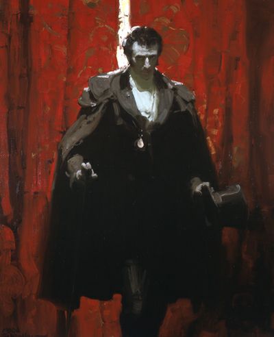
Featured here is an illustration for the 1928 Dodd, Mead & Co. edition of "The Count of Monte Cristo."

The source of the detail images is explained below:

* * * * *

The Kelly Collection has what is probably the outstanding holding of American illustration art by private individuals (not organizations). I was able to view part of it at The Frederick R. Weisman Museum of Art at Pepperdine University in Malibu, California towards the end of a January 12 - March 31, 2013 exhibition run. The collection concentrates on illustration art created roughly 1890-1935 and one of its purposes is to further knowledge and appreciation of illustration from that era.

Non-flash photography was allowed, so I took a large number of high-resolution photos of segments of those original works. This was to reference the artists' techniques in a manner not always easy to obtain from printed reproductions. (However, the exhibition catalog does feature a few large-scale detail reproductions.)

I thought that readers of this blog might also be interested in seeing the brushwork of master illustrators up close to increase their understanding of how the artists worked and perhaps to serve as inspiration for their own painting if they too are artists.

Below is an image of the entire illustration coupled with my work. Click on the latter to enlarge.

* * * * *

This image is from the Kelly Collection website.


Most artists using bold brushwork and plenty of impasto would paint subjects' faces noticeably more carefully. An example is a Dean Cornwell story illustration featured in another post in this series. But here Schaeffer backed off only a little from his 1920s vigor when he dealt with the count's face. Note the green on the face, shirt and shadow on the shirt, this in contrast to the red background.

Friday, May 10, 2013

Lincoln Grilles : Dip Into the Parts Bin

For a couple of decades, we in North America have become used to seeing Lincoln automobile grilles that looked like these shown below.

These are Lincoln Town Cars, a model recently dropped after many years in production. The upper photo is of a 2002 model, the lower shows a Town Car from around 2011. Their shield-like grille shape dates from the 1993 Lincoln Mark VIII, though rectangular grilles with wide chrome frames and thin, vertical bars continued on some models until the 2002 model year.

Changes in grille design rapidly accelerated by 2007 as Lincoln sales continued to dwindle from the 1989-90 peak. 2013 models have faces such as on the new MKZ model shown here.

I don't like this latest grille design. But I do find it interesting how Lincolns stylists raided the marque's historical parts bin, so to speak, in a search for a different theme from of 1993-2007 and the 20-odd years before that.

Consider the Lincoln Navigator SUV (sport-utility vehicle). The upper photo is of a 2003 model, the lower one shows the 2007 Navigator with a different grille theme. Where might that theme have come from?

Probably from the design Lincolns sported for the 1946-1948 model years. Shown here is a Lincoln Continental Cabriolet.

Then there is the grille on the 2013 Lincoln MKX crossover SUV. It has been around for a few model years and is similar in spirit to the MKZ shown above except that the grille bars are heavy and are aligned vertically rather than horizontally. And where might this have come from?

Once source was probably this 1995 concept car called the Sentinel. But we can push the idea even farther back to...

...the 1939-1941 model Lincoln Zephyrs and Continentals (above is a 1941 model Continental).

In the midst of this stylistic thrashing about, he find the...

...2007 Lincoln MKX (upper) whose grille reminds one of the of the 1964 Lincoln Continental (lower photo).

Where else might Lincoln stylist care to dig for traditionally based grille themes? I suggest these as starters:

The upper image is of a 1942 Lincoln Continental Cabriolet, the lower shows the grille used on 1949 Lincolns.

Wednesday, May 8, 2013

Up Close: James E. Allen

This is part of an occasional series dealing with detail images of paintings featuring the brushwork of the artist. Previous posts can be found via the "Up close" topic label link on the sidebar.

The present post deals with James Edward Allen (1894-1964), who spent much of his career creating lithographs as well as illustrations. Maybe that's why I wasn't aware of him until I saw one of his works in the exhibit mentioned below.

Featured here is an illustration for "A Carolan Comes Home" by Mary Synon in the January 1929 Ladies' Home Journal magazine.

The source of the detail images is explained below:

* * * * *

The Kelly Collection has what is probably the outstanding holding of American illustration art by private individuals (not organizations). I was able to view part of it at The Frederick R. Weisman Museum of Art at Pepperdine University in Malibu, California towards the end of a January 12 - March 31, 2013 exhibition run. The collection concentrates on illustration art created roughly 1890-1935 and one of its purposes is to further knowledge and appreciation of illustration from that era.

Non-flash photography was allowed, so I took a large number of high-resolution photos of segments of those original works. This was to reference the artists' techniques in a manner not always easy to obtain from printed reproductions. (However, the exhibition catalog does feature a few large-scale detail reproductions.)

I thought that readers of this blog might also be interested in seeing the brushwork of master illustrators up close to increase their understanding of how the artists worked and perhaps to serve as inspiration for their own painting if they too are artists.

Below is an image of the entire illustration coupled with my work. Click on the latter to enlarge.

* * * * *

This image is from the Kelly Collection website.


The composition of this painting is odd, but perhaps it makes sense in terms of the story being illustrated. That aside, the detail photo suggests that Allen had a nice touch as an oil painter. Like Dean Cornwell, Mead Schaeffer and many others dealt with in this series, he painted both thickly and comparatively freely: note the treatment of background items.

Monday, May 6, 2013

More Frank Duveneck Studies

Frank Duveneck (1848-1919) was an American painter who was influential in certain circles in the late 1800s. I wrote here about illustrator Greg Manchess being influenced by Duveneck's method of making studies for final paintings. The Wikipedia entry on Duveneck is here and a site devoted to him is here.

As with most artists' studies, Deveneck's seem to have been dashed off fairly quickly, though some have evidence of greater effort. The latter make use of a "square brush" technique whereby each brush stroke can (and often does) indicate a plane of the subject. Manchess tends to use a square brush style, so it was Duveneck's similar handling that served as inspiration.

Below are some examples from Duveneck.

Gallery

Guard of the Harem - study - 1879
This is on display at San Francisco's de Young museum. The subject's body and clothing are depicted loosely, but the face receives a careful square brush treatment.

The Music Master - 1879
Hardly any square brushwork here.

Seated nude - c.1879
But more here, especially on the subject's face and left arm.

Elizabeth Boott - study - 1886
Despite her father's disapproval, Boott wanted to marry Duveneck, and they did. The title (which might not be a formal one) suggests this was painted before they were wed.

Elizabeth Boott Duveneck - 1888
Here is Duveneck's portrait of his wife, completed around the time she died. An account of Deveneck and Boott's relationship is here. Note that square brushwork is not evident in this finshed work.