Friday, April 29, 2011
Winnowing Art Books
Their time has nearly come. They lay stacked atop chairs and book cases, even tucked away in corners on the floor. Soon they will be gone. For my wife is making grumbling noises and even I can see that the book buildup in the small bedroom I use as a library / painting studio is too large even for my taste in messiness.
I know what to do; the important matter is how. Which books stay and which head for Powell's in Portland?
Keepers include references such as general art histories, potted artists' biographies and short takes on art movements. I'll hang on to most monographs about artists, particularly those I really like. Ditto similar books about architecture and industrial design.
Then there are some gray-area books. These are books I can't make up my mind about; more time is needed before I can make a stronger save / sell decision.
Books I'm discarding? Those dealing with periods of less interest are prime candidates; that means before the mid-1800s. There are exceptions, of course: Tiepolo, Velázquez and British portrait painters starting with Reynolds come to mind.
Then there are redundant books about given subjects. For instance, I have more then one book about Art Deco, Art Nouveau, Symbolism, Impressionism, skyscraper architecture, Alphonse Mucha, Tamara de Lempicka, Gustav Klimt, Charles Rennie Mackintosh, Joseph Urban, Raymond Loewy, Maxfield Parrish, Tiepolo, Velázquez, Norman Rockwell, John Singer Sargent and several other people and topics. Assuming overlap in illustration subject-matter, my inclination here is to discard older works because the quality of color reproduction usually isn't as good as it has been more recently.
I'm also getting rid of books that I'm not likely to re-read. Examples here include group biographies of Surrealists and Paris Bohemians as well as those about individuals such as N.C. Wyeth and Harvey Dinnerstein.
How-to books about painting that I seldom refer to are due for the axe too.
It's somewhat easier to discard books than it was 20 years and more ago. That was when there was no Internet and getting to a library to find reference material was a hassle. I found it easier to maintain my own library where what I might need would be at hand. Nowadays I find myself downloading images and using Google and Bing to track down information about artists and movements, so even those general reference books might disappear the next time I do housecleaning.
All well and good, I suppose. But the best solution (from my perspective) is to have enough space that I don't need to get rid of so many books so often. Or at all.
Wednesday, April 27, 2011
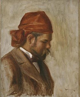
Molti Ritratti: Ambroise Vollard
Ambroise Vollard (1866-1939) was an art dealer and writer who championed key Modernists during their emergence in the early 20th century.
In return, a number of artists painted his portrait. Below are some examples arranged in rough chronological order.
Gallery


Monday, April 25, 2011
World Trade Center in Miniature: Still Standing
The 10th anniversary of the destruction of New York City's World Trade Center is coming in a few months. Since this is an art and design blog, I thought it might be worthwhile to mention the WTC's architect, Minoru Yamasaki (1912-1986). His Wikipedia entry is here, and contains a long list of the buildings he designed. For a more detailed biography, however, click here -- though be warned it's a bit Seattle-centric.
Yamasaki, like his near-contemporary Edward Durell Stone, could not quite come to terms with International Style architecture and resorted to applying touches of decoration. That decoration usually had an industrial, cookie-cutter repetition to it -- perhaps an early Postmodern wink-and-nudge that the decoration wasn't (or maybe really was) serious; perhaps there's a justification for ambiguity.
The World Trade Center design didn't appear from a void. A structural prototype of sorts was built in Yamasaki's home town, Seattle, a few years earlier and some design themes were tested there too. Let's take a look.
Gallery


The towers were so huge and surrounded by other buildings that a comprehensive take isn't possible from photography. At the top is an aerial image that corresponds to what many of us have in mind when the WTC is mentioned. But the structures weren't all just narrow windows flanked by vertical strips; at the base some of those strips merged into Gothic-like pointed arches, as can be seen in the photo immediately above.

Century 21, Seattle's 1962 international exposition, included a work by Yamasaki -- a cluster of structures now named the Pacific Science Center. The best-known feature is the Gothic towers shown here.

For our purposes, the base detailing is of most interest. Note the similarity to the Trade Center street-level two photos up. No, the detailing isn't identical, but the spirit is consistent.

Apologies for the poor image, but it was the best I could grab off the Web showing the entire building. My understanding is that structural ideas used in the WTC were first developed for the IBM building. Some of this is apparent in the similar window treatment. The only superficial differences of note are the use of rounded, rather than pointed, arches at the bottom and the lack of elevator lobby breaks. Seattle's IBM Building still stands, though it's now overshadowed by larger structures nearby.
Friday, April 22, 2011
Molti Ritratti: Diego Martelli
He's an obscure figure to non-Italians, but Diego Martelli (1838-1896) was an important art critic who championed the pre-Impressionist Macchiaioli group. Some of them, in turn, favored him by painting his portrait.
Below are examples.
Gallery

Boldini gained fame for his flashy society portraits made after leaving Italy for Paris. The painting above is basically a small sketch that can be seen in Florence's Pitti Palace.

Fattori painted Martelli and his wife (in a separate work) while at Castiglioncello, a seaside town popular with some of the Macchiaioli.

This too is in the Pitti collection.

Degas had family connections in Italy and also found time to portray Martelli.

I find it interesting to see how different artists portray the same subject. In the case of Martelli, there could be a little disagreement regarding his nose, and his hair color also varies (it seems brown in the earlier two portraits; might he have dyed it black a few years later?).
Wednesday, April 20, 2011
Franz Bischoff: Best California Impressionist?
It's too late. The exhibit closed and all that remains is this book which served as a catalog. But for once I lucked out and happened to be in Southern California while Franz Bischoff's paintings and painted vases were on display at the Pasadena Museum of California Art.
Pasadena is an opportunity-rich zone when it comes to art museums. The Huntington Library and Norton Simon hog the limelight, so I wasn't even aware of the PMCA until I noticed someplace on the Internet that a Bischoff exhibit was there. Bischoff's paintings seem to be mostly in private collections or art galleries, so it's a rare treat to be able to view a significant number of them. PMCA teamed with the Irvine Museum (probably the center of gravity for California Impressionism) and between the two were able to tease out enough of Bischoff's work to fill three rooms.
Franz Bischoff (1864-1929) was born in the Austro-Hungarian Empire and emigrated to the United States when he was 21. He worked as a porcelain decorator in the Midwest, eventually becoming famous in that field and gaining a certain amount of wealth through his work and a line of glazing products he developed. Intrigued by California, he eventually moved to Pasadena's Arroyo Seco (fancy Spanish for "dry gulch" -- not far from where the Rose Bowl stadium now stands). Once there, he took up easel painting.
He painted a few scenes with people, more of flowers, but focused on landscapes. In my judgment, he was very good at capturing classical California. Perhaps he was even the very best at it, though there were some others in his league who I'll present in future posts.
As for his technique, he tended to combine a basic color for an area, be it in light or shade, with bits of complementary color and perhaps some other hues. This approach was current in the early 1900s -- the illustration work of N.C. Wyeth followed this practice, for example. The result is a rich, interesting surface.
Also, Bischoff seems to have been careful in his selection of paints and how he used them because the examples I saw at the exhibit were in good condition with no apparent color deterioration.
Here are some Bischoff paintings:
Gallery


This was a highlight of the exhibit. Unfortunately, the original image I downloaded (top) distorts the painting's colors towards red-orange. I couldn't find a better image, so the lower image is my attempt to adjust it to be more like the original.


Bischoff didn't paint the Carmel area until the 1920s. The light there is usually more subdued and misty than along the Southern California coast and interior where he began doing landscapes.

Bischoff's Utah paintings were done near the end of his career. They are simpler than his earlier work, perhaps influenced by the artistic zeitgeist of the late 1920s.
Monday, April 18, 2011
Bel Geddes' Modernist Tears
Something we need to think about when dealing with Modernism is how fresh and different architectural and industrial designed objects appeared when they were new and stood in contrast to nearly all existing structures and manufactured products. Even if these early examples fueled imaginations and desires of some, often the young, proponents faced a hard slog persuading managers to commit money for new construction or factory retooling during the early years of the Great Depression. This required salesmanship, and first-generation industrial designers probably spent considerable time trying to drum up business.
This certainly was true of Norman Bel Geddes who as early as 1932 was able to get his book "Horizons" published, surely as an exposition of Industrial Design as well as a sales tool for his own firm.

Aerodynmic research at the time favored a pleasing shape popularly called "teardrop" that, when properly applied, allowed an airplane of a given weight, frontal area and available power to fly faster thanks to reduction in what might be called form or shape drag. In part thanks to Geddes' book, the public at large began associating teardrop shapes with speed and modernity in general, and by the late 1930s utterly static objects such as pencil sharpeners were styled as teardrops or incorporated other faux-aerodynamic features.
In some cases -- I'm thinking of certain French sports cars of the era that I'll write about soon -- the results were pleasing indeed. So if teardrop became a design fashion cliché, it wasn't necessarily a bad one.
Below are Geddes designs from the early 30s, most of which were featured in Horizons. They seem impractical given what we have learned about aeronautics and engineering over the last 80 years. Nevertheless, they remain provocative and fun to look at.
Gallery

Geddes in Horizons: "Employing the principles of aerodynamics, I designed a motor car four years ago, and called it Car Number 5, meaning a car of five years from then. Working backwards in four stages, we succeeded, by the time we came to Car Number 1, in designing an automobile which, except for its extreme simplicity, would resemble present-day cars.... Each of the five models represent a twenty percent change over the previous one as each is advanced by degrees toward a definite idea standard...." Number 8 is one of a series representing "a further departure." Its exterior "is streamlined, other than on the ground side, to as near the drop form as is practicable. It is not designed for higher speed but for present-day speed with less power." At the front positioned between the wheel wells are a driver and passenger. Behind them are two rows seating three each. A small luggage compartment lies behind the last row of seats and in front of the motor which is behind the rear axle. At the extreme rear, including part of the fin, is the fuel tank.

This concept came after Horizons. I wonder why it needs eight wheels.

Geddes noted that the bus "accommodates fifty-three persons, including a driver and steward. The lower deck deck seats thirty-three persons; the upper deck twenty. This seating capacity exceeds by twenty the average seating capacity of conventional buses with the same [250-inch] wheel and is greater than that in any bus of cubic content yet designed." Luggage is stored the the rear of the upper deck, the motor is mounted over the rear axle.

"I have designed an ocean liner 1808 feet in length, with a molded depth of 120 feet, and approximately 70,000 tons displacement. Streamlined as to both hull and superstructure, it is designed for luxurious accommodations, economy of operation, and increased speed performance. It is a steamship that can be built and operated under existing conditions. Accommodations are provided for 2000 first-class passengers and a crew of 900 men....
According to calculations, this liner should not only be more economical to build and operate than the fastest liner now in service, but she should, in addition, cut transatlantic steamship time by about one day."
I must note that the Geddes length figure is surely a typographical error; diagrams in the book suggest a length of about 1,000 feet and the beam of 110 feet coupled with the 1,808 length yields an unrealistic length-beam ratio. Overall, the ship he proposes is dimensionally a trifle larger than the largest liners of the day. As for speed, the ultimate Blue Riband champion, the SS United States, crossed the Atlantic about 20 hours faster than the record when Geddes wrote his book, so his prediction was not out of line.

This was designed with the assistance of aeronautical engineer Otto Koller in 1929, so it was extremely radical in it day. Accommodations were for 451 passengers and a crew of 155. "She has a total wing spread of 528 feet. On the water she is supported by 2 pontoons 104 feet apart [approximately the wingspan of a typical World War 2 heavy bomber], 235 feet long and 60 feet high.... Total power required, 38,000 horse power -- 20 motors, each 1,900 horse power; maximum speed, 150 miles per hour; cruising speed, 100 miles per hour; normal flying ceiling, 5,000 feet; absolute ceiling, 10,000 feet; time of climb to ceiling, 1 hour; speed at ceiling 87 1/2 miles per hour; cruising range without refueling, 7,500 miles, gross weight, 1,275,300 pounds.... The flying time between Chicago and Plymouth [England] is forty-two hours. She is refueled in flight while passing over Newfoundland." A few pages later, he mentions that the plane would carry six extra motors and that it would take but a few minutes to exchange a bad one for one in good working order. As part of his conclusion Geddes states: "Air liners of a size that is not easily visualized to-day will eventually supplant ocean liners in intercontinental transportation of express traffic - passengers and mail, but not freight."
The last bit largely came true, though of course intercontinental freight of certain kinds is now transported by air. Another reasonably correct projection was the 450-passenger capacity. The airplane itself, while theoretically possible, could not have been built before the early 1940s -- this on the basis of the horsepower requirements. Whether the plane would have been aerodynamically sound, I'm not qualified to say.
Friday, April 15, 2011
Overrated Paintings: Botticelli, da Vinci and Picasso


Some paintings, like some people, are famous because they are famous. And, like some people, they might not be deserving of their fame. Consider the paintings shown above.
To begin, I assert that I have nothing against Botticelli's Birth of Venus. Well, I don't think his Venus is a real knockout -- but I can say the same about most other Venus paintings I've seen ... tastes do differ. Worse, the average viewer no longer can see the painting unhindered; the Uffizi Gallery has it shielded by a thick layer of transparent material (I'm not sure what it is, but it dulls down the painting considerably). But my core position is that the painting doesn't strike me as being superior to any number of fine Renaissance-era paintings that are better-composed and just as well executed.
Da Vinci's Mona Lisa is another painting in the same category: nothing wrong with it, but not outstanding compared to other works of its time. I first saw it in Washington, D.C. when it was on tour and manage to be in the same room with it when visiting the Louvre (though the crowds make it hard to get very close). In every instance I found it shielded like Botticelli's painting, so I can't claim to have really seen it in the sense of being able to do an examination.
Pablo Picasso's Guernica is another matter.
Five years ago when I was part of the 2Blowhards blogging team I wrote this post about it. Here are the relevant remarks:
This is going to be difficult, but try looking at "Guernica" as if you had never heard of Pablo Picasso and knew nothing about what the painting was supposed to depict. Close your eyes, click your heels twice, spin around three times and pretend really hard that you're seeing it for the first time. Okay?
Open your eyes. What do you see? It's a value-painting: no real colors, just various shades of gray with tendencies towards brown or blue. There are straight lines serving as edges of flatly painted or patterned areas. In the top-center is a crudely-drawn light bulb and reflector. The rest of the painting is populated by images of people and animals that are crudely-drawn, distorted. A hand attached to what might be an arm is clutching what seems to be an oil-lamp. There is a crudely-drawn woman at the left who might be screaming while holding a crudely-drawn baby who is sick or dead. On the right is an extremely crudely-drawn human with raised arms. To the lower right is a very crudely-drawn woman leaning forward. Along the bottom is a crudely-drawn man on his back whose eyes are at angles to each other. He seems to be grasping a broken sword in his right hand and might well be dead. There are three creatures depicted. The smallest could be a bird whose head for some reason is raised to the sky. Towards the left is what seems to be a bull gazing back at the viewer: it too is crudely drawn. At the center is what might be a horse.
The compositional effect is jarring, not placid or soothing. Composition aside, the painting has whatever impact it has because it is large, being a mural.
A curator or art historian would likely pigeonhole "Guernica" as a mix of Cubism and Expressionism.
Asked to tell what the painting represents, an ignorant viewer might stumble on the fact that it has to do with war (there is that possible broken sword) but might well come up with a different interpretation.
When I viewed "Guernica" I knew its background and knew that it was supposed to be a masterpiece of Modernism. I tried really hard to like it. But I failed.
I'm far from being the first to lament about works of are that are so famous that people feel compelled to love them. I saw Guernica once again last October and the crowds were cooing over it. That seems to be the nature of things, so all I can do is shrug my shoulders and write the occasional blog post pointing out that there might be less than meets the predisposed eye.
Wednesday, April 13, 2011
Norman Rockwell, Colorist
There's a Norman Rockwell exhibit rattling around the country called American Chronicles: The Art of Norman Rockwell. It's currently playing in Tacoma, Washington, so of course I had to see it -- the goal being to reinforce impressions gleaned from seeing his works at the Norman Rockwell Museum. Not surprisingly, that museum is the organizer of the exhibit, because its collection of Rockwell's paintings and artifacts is comprehensive.
Years ago when I lived in Albany, New York, I drove across the hills to Stockbridge, Massachusetts, a charming town that was Rockwell's last residence. He was living there then, just around the corner from the Red Lion Inn; you could easily spot his detached studio near the house. There was a Norman Rockwell Museum even then. It was housed in ... a house (if my memory is correct: a house or another structure in or near the Red Lion). I went through it once, but at the time was out of touch with art and still in thrall of the modernism that Everyone told us was what was true in Fine Arts. Rockwell was considered a curiosity.
Setting aside the subject-matter, what one finds is a high level of technical skill. One aspect of this that impresses me is that this skill shows even though Rockwell had to do the actual execution (not including planning, reference photography, etc.) in a matter of days or perhaps a week or three to hit his deadlines. Contrast this with some of the Pre-Raphaelite artists who might labor for months on a single work.
One example that struck me was his treatment of a wooden chest of drawers that served as part of the backdrop to the main subject; the wood grain was very nicely handled and more detailed than other contemporary illustrators might have bothered with.
The title of this post asserts that Rockwell was a "colorist" -- to me, that means someone appreciative of color subtleties and interactions and who is able to include such in a painting. Fine Arts painters are most likely to fall into this category, but illustrators also can make the grade. Examples include Frank Frazetta, N.C. Wyeth and, of course, Norman Rockwell.

The painting shown above was part of the exhibit. If your computer allows enlargement, this can be done in two stages; after the first enlargement, click on it again and you might get an even larger view. Even if you are able to enlarge it, Rockwell's use of colors is still not as apparent as when viewing the painting in person. In the stage-two enlargement you might notice areas of dark red in several places, especially on the sleeve folds of his bent arm. In person, this red is much brighter and, in my judgment, unnecessary. Otherwise, Lincoln's skin and clothing contain many hues and not just the basic color.
Many of the faces Rockwell painted have bits of blue and green along with the expected variations around red-orange. I was often a little startled when a sort of turquoise kept popping up on subjects' skins. These subtleties often didn't make it all the way to printed magazine covers, so Rockwell clearly felt he had to do his artistic duty in full knowledge that his fans wouldn't be able to see all that he'd actually wrought.
Other items in his illustrations also were painted with traces of color complementary to the main hue, creating a rich appearance. For example, a large leather bag slung over a coachman's shoulder contains more dark green than tans and browns.
I could go on, but perhaps the best thing I can do is urge you to view some of Rockwell's originals. The best site is the museum in Stockbridge. If you can't get there, then try for the exhibit I've been discussing (the link lists locations following its Tacoma stand). And there might be examples of his work here and there; check the internet to discover if a Rockwell is nearby.
Monday, April 11, 2011
Pusher Military Aircraft: Failed Concept
From what I read, "pusher" propeller-driven aircraft have certain theoretical aerodynamic advantages over conventional "tractor" aircraft (where the propeller is positioned in front of the engine).
Though it's not obvious from looking at a photo or a prop-driven airplane in flight, a forward-facing propeller whips a lot of air into a spiral pattern that twists around even a highly streamlined fuselage (if it's a single-engine aircraft) and disrupts airflow over the wings almost no matter where the propeller is positioned.
The solution to all this nasty propeller-induced turbulence? -- place the propeller behind the engine so that it pushes rather than pulls, leaving the churned air behind the plane rather than engulfing important parts of it.
Even though the convention was the tractor arrangement, a number of early airplanes were pusher types including the Wright Brothers' 1903 flyer and some Great War combat planes. From time to time aircraft with tractor and pusher propellers were built. But designers quickly and nearly universally preferred the tractor arrangement.
The siren song of the pusher was heard once again in the late 1930s and early 40s for military planes. This post deals with some designs that reached flying prototype status, but only two of which entered real military service.
Despite the potential advantages mentioned above, the pusher configuration had its limitations. One was that it was often difficult to provide sufficient cooling for the motors. This is obvious for air-cooled engines requiring a large blast of air passing around the cylinders, but apparently was even the case for water-cooled engines requiring radiators.
Another problem was propeller clearance on takeoff and landing. There was a risk the the props might dig in to the ground when the aircraft was assuming a nose-up attitude. Tractor aircraft had much less to worry about in this regard.
But perhaps the greatest problem was what to do when the pilot had to bail out of a single-engine plane; without special steps taken, he would be chopped up as he passed through the propeller arc. Solutions included feathering the prop or detaching it before bail-out. Another solution was the ejection seat common on jet fighters but something that didn't emerge until towards the end of World War 2.
It is possible that the ejection seat and contra-rotating props of comparatively small diameter might have let to successful fighter designs by the late 1940s. But the advent of jet propulsion along with diminishing returns to increased piston engine power ended propeller-driven fighter planes regardless of whether they were tractor or pusher. The only real pusher success was a huge bomber, as noted below.

YFM-1 was a pre-war concept for a plane that could serve either as a bomber escort or an interceptor. It had a five-man crew including a 37-mm cannon operator in the front of each engine nacelle (and subject to being decimated on bail-out). The planes were too heavy for the power available and the pusher system created pitching problems. There were even more problems -- see the link for an enumeration -- so that even though a test batch had been ordered, the Airacuda never entered full-scale production.

The XP-54, along with the XP-55 and XP-56 were results of the Army's attempt to unleash airplane designers to create wild and crazy stuff. For some reason, all three participants in the program opted for the pusher layout. Every project resulted in disappointment, one important factor being that the engines planned initially were technical failures and replacement motors lacked enough power for performance superior to existing production models such as the P-51 Mustang. The XP-54 was the most conventional design, featuring a twin-boom arrangement to support the tail.

The XP-55 was more radical, having a "canard" layout where instead of tail-mounted horizontal stabilizers, they are placed near the nose.

Most radical of all was the XP-56 which had no stabilizers at all, being close to a flying wing design with a fat fuselage. Note that the XP-56 had contra-rotating props with a smaller diameter of arc than a single-prop version might have. This would lessen the risk of prop dig-in on takeoff rotation or landing.

This Swedish fighter actually reached production and saw service in the late 1940s and early 50s. Interestingly, it was adapted to jet power and that version also was produced.

Two Army pusher configuration "intercontinental" range bomber designs reached prototype and test-batch status in the late 1940s. The XB- and YB-35s are manifestations of Jack Northrop's fascination with the flying wing concept. Like the J21, the YB-35 was adapted to jet power as the YB-49, but production contracts went to the plane below.

Several hundred B-36 bombers were built and served in the U.S. Air Force's Strategic Air Command during the 1950s. It featured a pusher layout soon augmented with four jet engines mounted in pods below the wings for greater target-dash speed. Although the B-36 had its problems, it stands as the most successful military pusher aircraft since the Great War. The B-36 was replaced by the eight-jet B-52 which has remained in service for more than half a century.
Friday, April 8, 2011
Botero and the Art of Fat
Fernando Botero (1932 - ) likes to paint fat people such as these:


He seems to make a good living at it through sales of his paintings and reproductions -- good enough that he can flit from Paris to his native Colombia once a year and indulge himself by painting a large number of canvasses that proclaim his political views. For more details, a lengthy Wikipedia entry on him is here.
What interests me is that the man has succeeded commercially by painting what are fundamentally cartoons. And apparently he gets enough Art Establishment respect to be featured in art museum and university gallery exhibits.
The art career pole strikes me as being greasier than most, so I'm almost never completely critical when an artist gains some fame and even fortune in his own lifetime. Nevertheless, the rewards system in the Modern era usually favors artists who I consider undeserving. Botero is one of those. Based on his output, he really should have been a Postmodern magazine illustrator creating whimsical little drawings of fatties to decorate articles.
Subscribe to:
Posts (Atom)